
I’m finally getting around to posting about our recent kitchen remodel.
Our extremely dated kitchen has waited quite unpatiently for a very, very long time for me to have time to give it the much-needed facelift it so desperately deserved.
Before we get into what we updated, here’s what wasn’t changing:
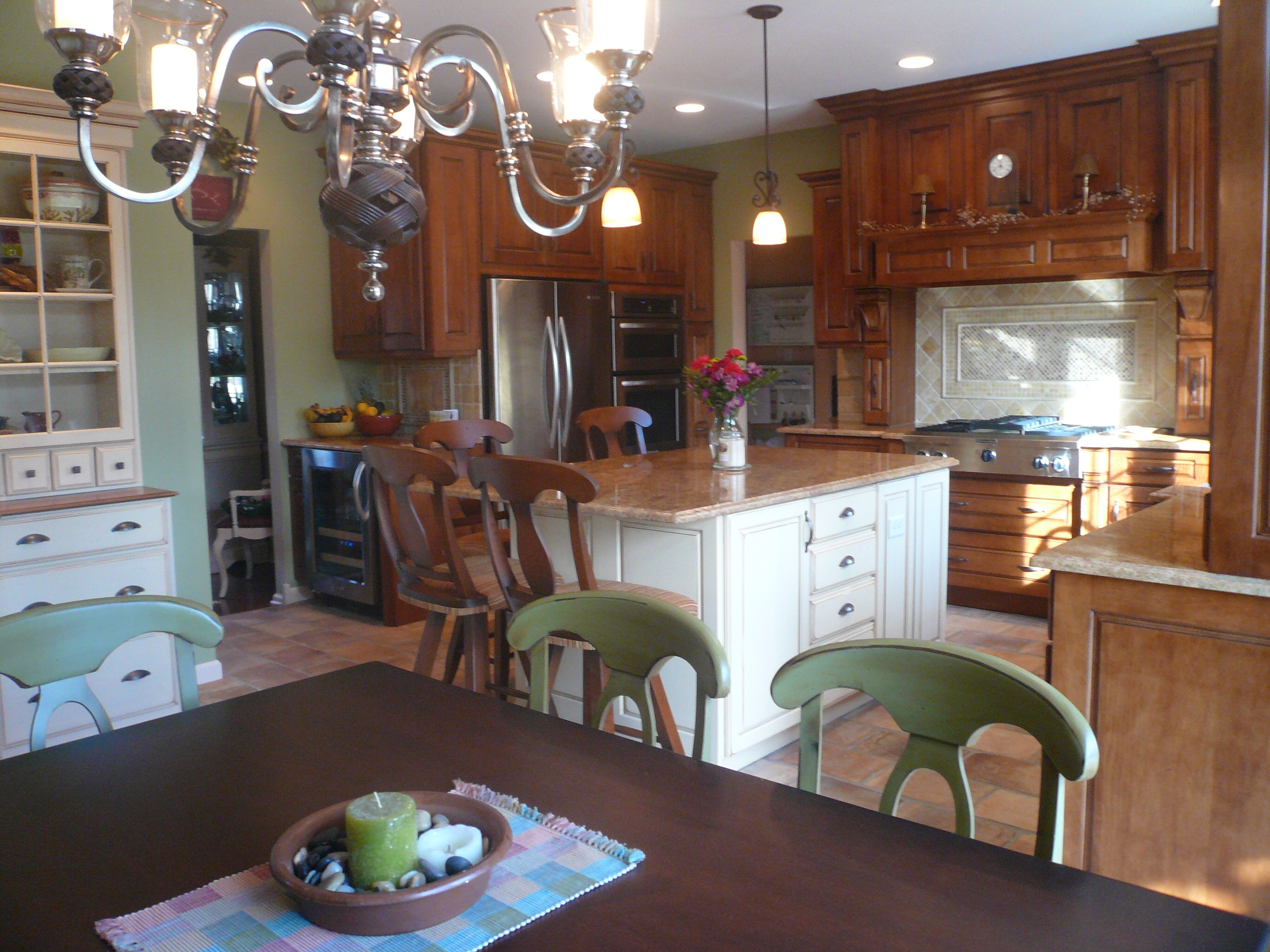
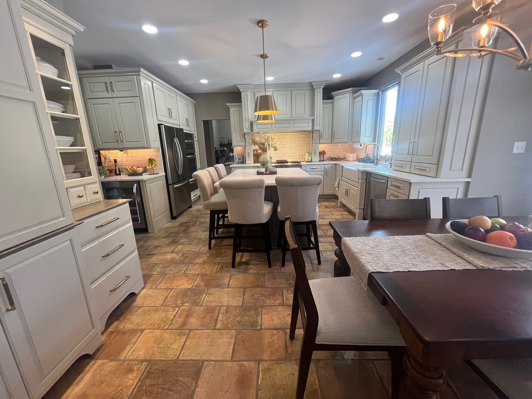
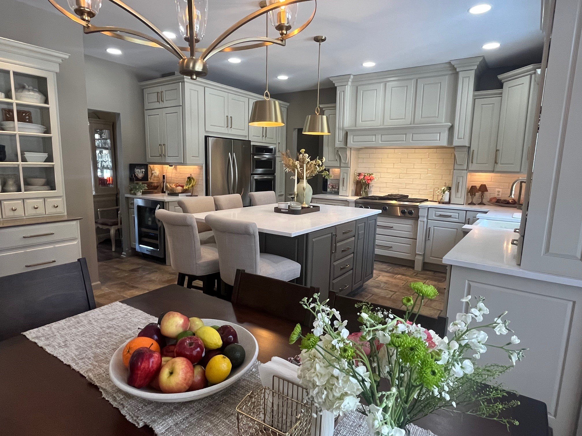
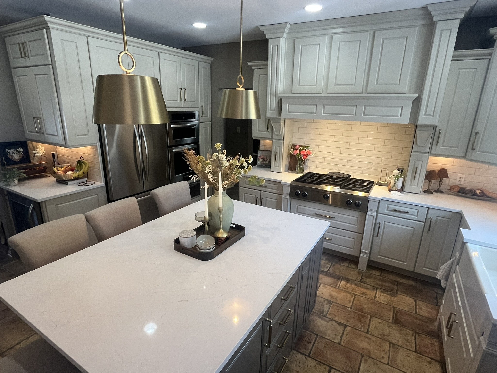
1) the custom cabinets were staying – and getting refinished, not replaced
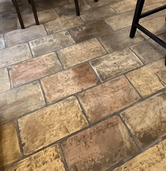
2) the terracotta floor wasn’t going anywhere.
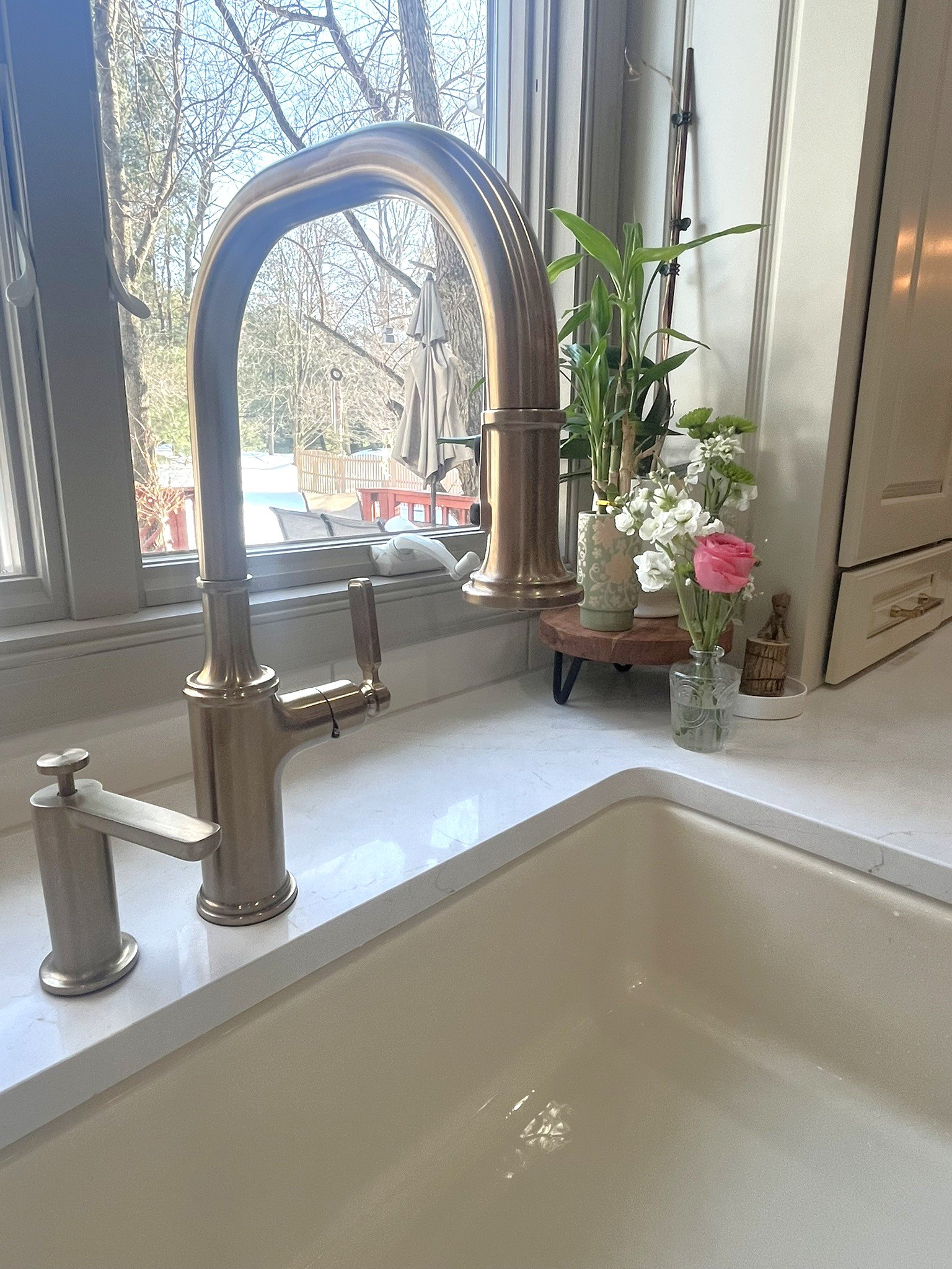
3) I still love my Kohler farmhouse sink and the appliances still work 🙂
This last one was definitely the biggest design challenge. But if you wait long enough, styles come back around, right?
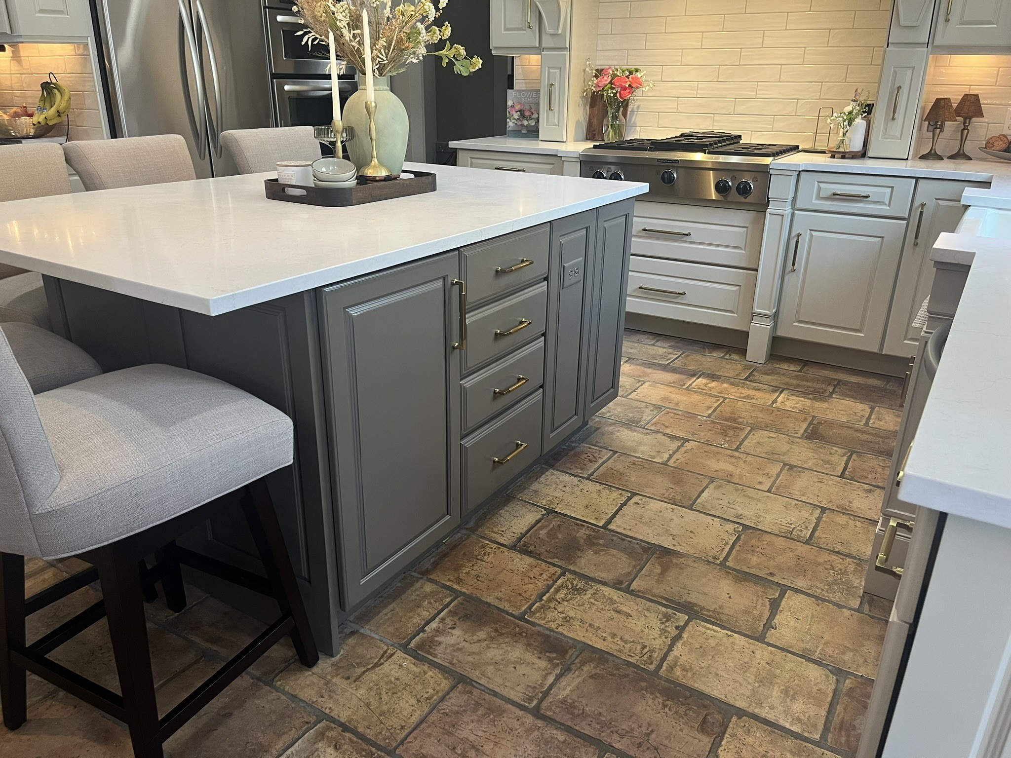
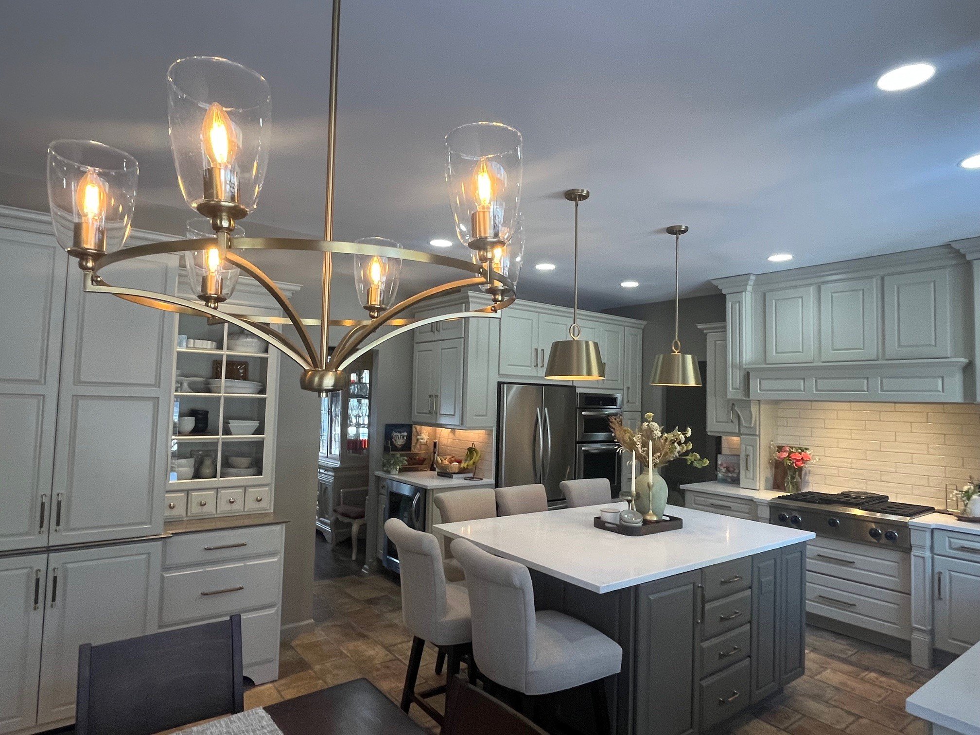
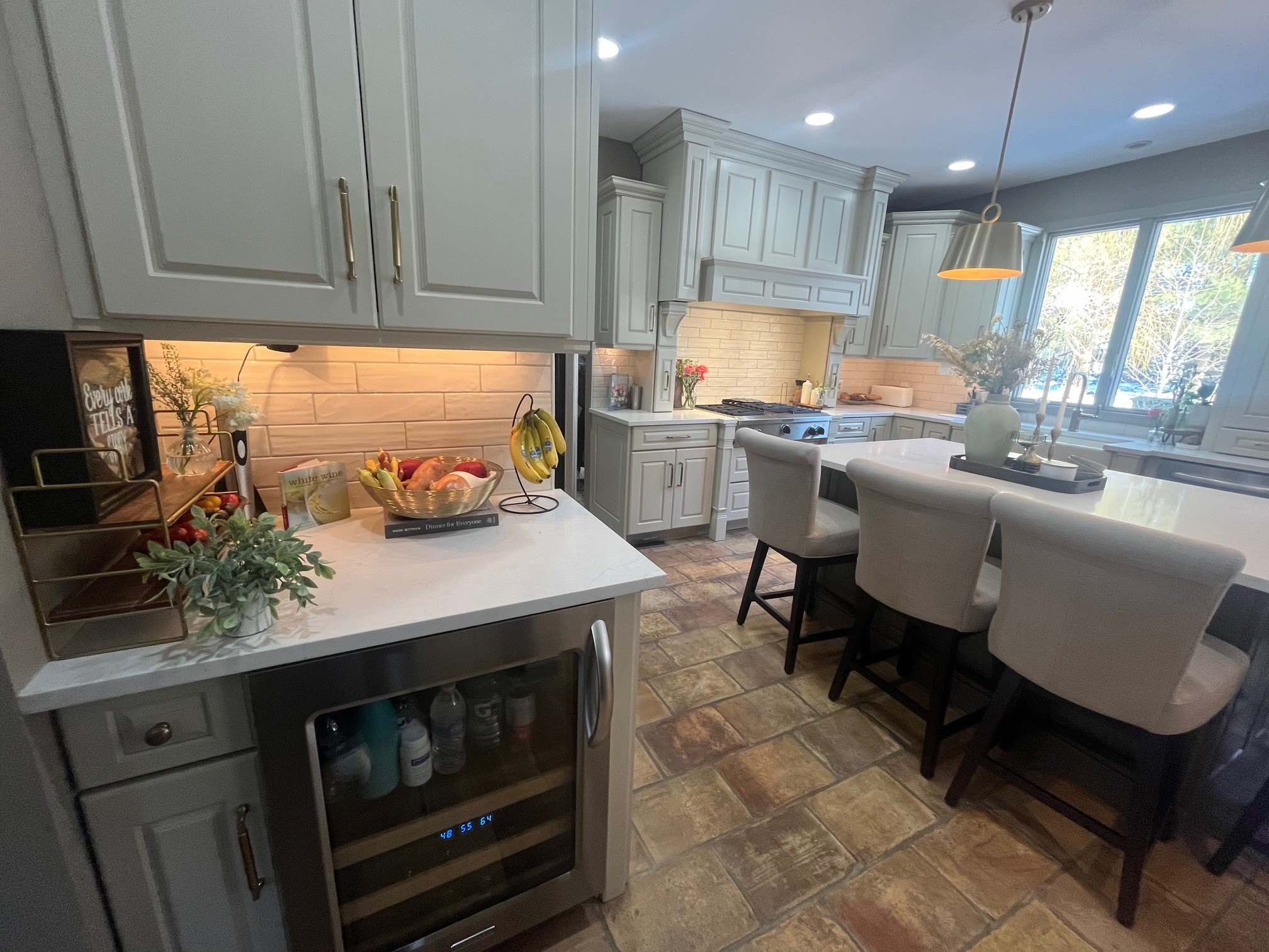
In this year’s Design and Product Trends presentation, my bestie Dawn Duhamel with DTJ Design (who still co-hosts this amazing program I co-founded and co-hosted for 7 years) said to keep an eye out trendwise for “a spotta terracotta”. So my beautiful Ann Sacks terracotta floor -reclaimed tiles from barn ceilings in France – was going to remain!
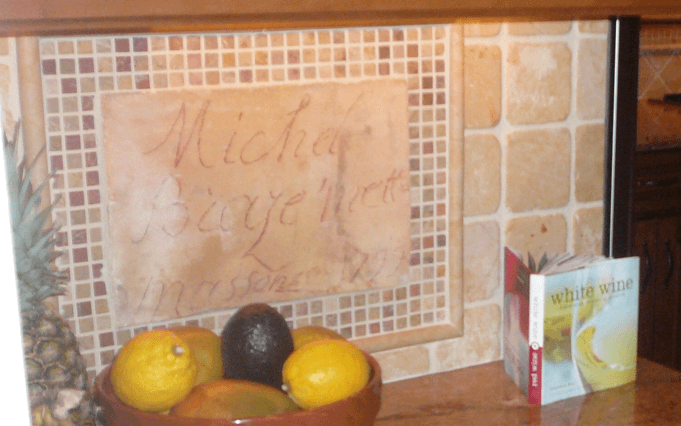
Crazy story around this tile, and why it’s so important to us: Back in 2007, when the installer unpacked the boxes of tile, they were caked in clay and mud from when they were removed. One of the tiles had handwriting on it that said: Michel Biaze’mette and then Massoner 1799. Since “maison” means house in French we think, (or maybe we wanted to believe) that Michel might have been the builder or owner who signed the tile. We thought this was so cool we had the tile framed as part of our backsplash where it became a conversation point for the last 19 years.
Thankfully, that Refined Classic/Updated Traditional look that we first reported on in the 2024 Trends presentation is now going strong. At the end of the day, I’m really a stylish-yet-tailored kind of girl. And surviving the modern cool white and grey trend of the last zillion years- during which time my home was decidedly “out of style” – I’m delighted that this “old-with-a-new-twist” style has really gained momentum over the last year or two and is now mainstream enough to be The Big Thing in design styles.
The Faucet That Started It All
The first selection was Moen’s Smith faucet. I was NOT kidding in the 2024 Design and Product Trends Presentation when I said it was my favorite product and couldn’t wait for it to debut later that year. I absolutely positively LOVE the elegant classic design. The beautifully-shaped fluted handle adds a tactile textured element and feels fresh yet timeless.
I have been especially excited about the newer softer, more muted Bronzed Gold finish from Moen and some other suppliers, because I didn’t want the bright shiny brushed gold that’s been hot for so long. Personally, I think the Bronzed Gold finish is more elegant and it’s better suited for my style (Side note: I am so excited that Smith is finally available for the bathrooms!!!!!!!!!!!!!!)


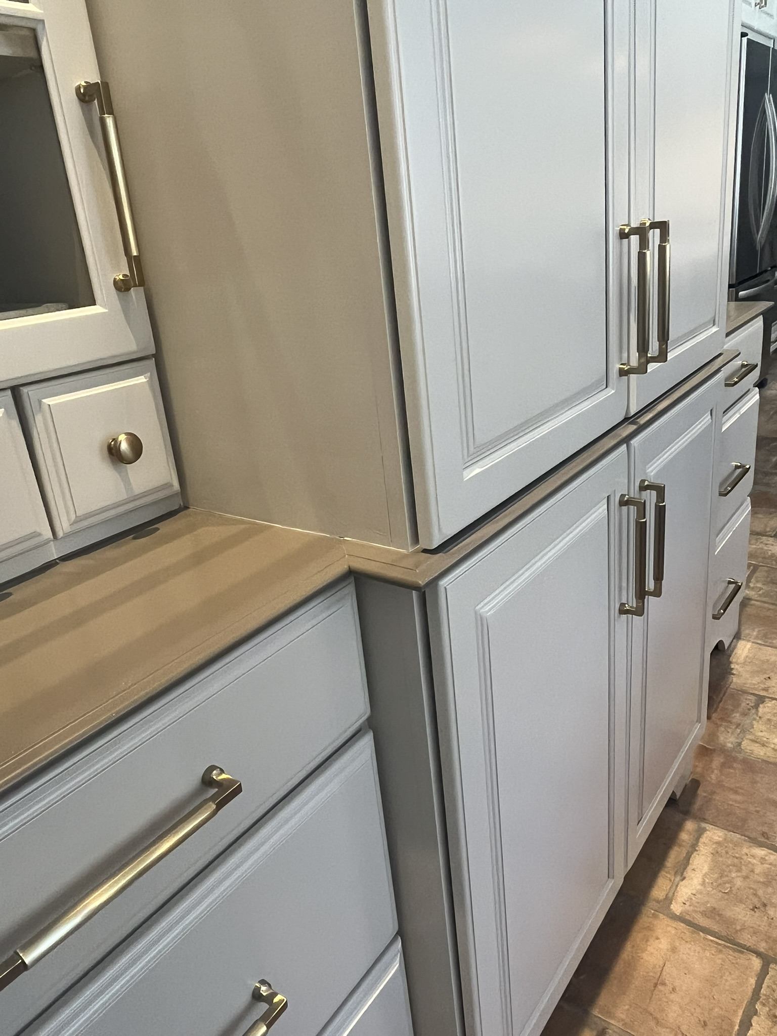
The Cabinets: The Biggest Challenge and Best Surprise
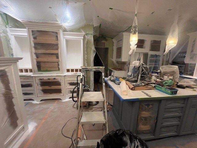
The biggest challenge of the entire remodel was the cabinets.
The refinisher could only do paint even though I originally wanted stain. I didn’t want a stark white but also didn’t want to lock myself in to a strong color.
Thankfully, the incredibly talented Heather Miller came to the rescue.
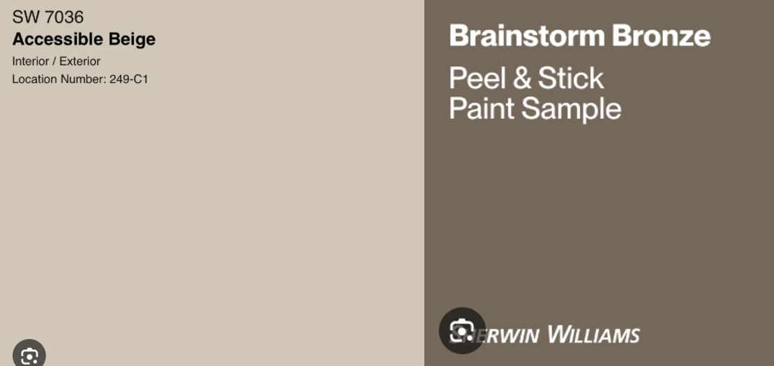
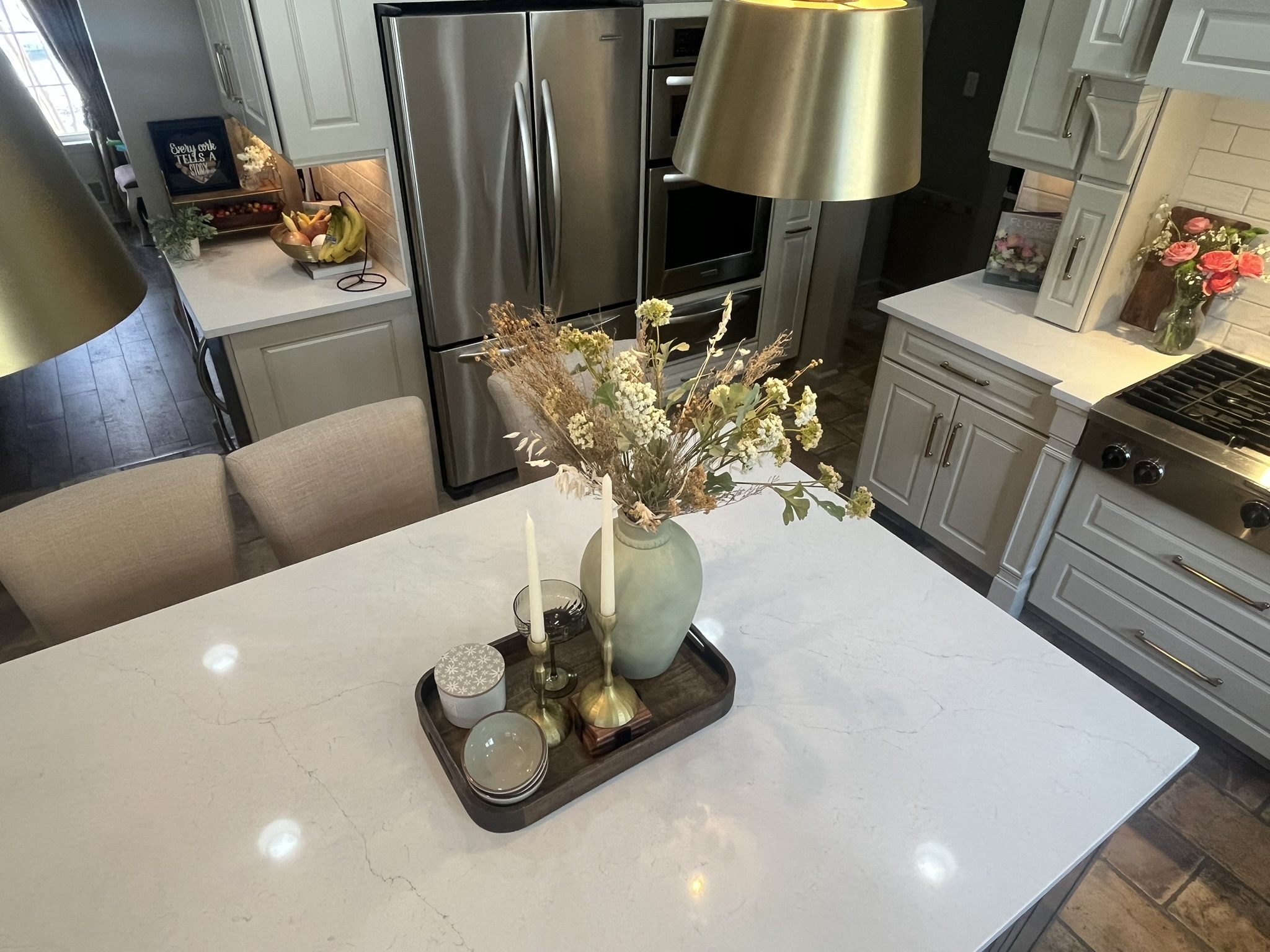
We landed on a lovely, comfy, warm creamy white (Sherwin Williams’ Accessible Beige ) on the perimeter cabinets. It also tied in beautifully to the specialty finish of my Kohler farmhouse sink, called Cane Sugar, that I was not going to part with.
For the island cabinets, Heather knocked it out of the park with a rich taupey-bronzey Brainstorm Bronze. The Brainstorm Bronze perfectly picked up the taupe grout on the floor, grounding the kitchen beautifully.
We also used it on the horizontal surface of our full-height cabinet hutch, so the piece continues to read more like furniture (with its apothecary drawers).
We also replaced the reeded glass in the hutch with clear glass to go from farmhouse to refined.
And I have to admit – I’m BEYOND SHOCKED how much I love the traditional cabinet door style now that it is painted.
The only thing I really dislike is the staggered upper cabinets, but the custom-cabinet layout functions perfectly, so it wasn’t worth changing.
(Side note: if you’re short like me, bringing the cabinets all the way down to the counter is a game-changer for reaching everyday plates, glassware, and the drawers that sit on the counter hold serving utensils so conveniently.)
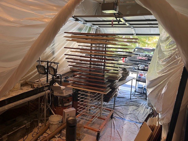
If you’re in NJ, our cabinet refinisher was one of the most professional companies I’ve ever worked with. Mikespaintingnj was a 20 out of 10. They set up a whole shop in our garage and uses a special paint just for cabinets.

The Transformative Power of Paint
Originally we were planning to use the same creamy soft white wall color in the kitchen that we were using to repaint the adjacent family room and main areas of the house INSERT PAINT NAME (Buh-bye to that golden beige tone that screamed “Tuscan kitchen circa early-2000s). It seemed like the safe and logical choice.
But when I tested the white walls against the gorgeous creamy white cabinets, the whole space suddenly felt cold and stark — definitely not the look I was going for.
So I took what felt like a slightly scary leap of faith and painted the walls Brainstorm Bronze, the same color used on the island cabinets.
The result completely transformed the space. The contrast beautifully sets off the creamy cabinetry, grounds the kitchen with warmth, and really makes the cabinets pop. Even better, it adds a layer of depth and sophistication that pulls everything together and makes the space feel much more intentionally designed.
Sometimes the bold decision is the one that makes the entire design click.
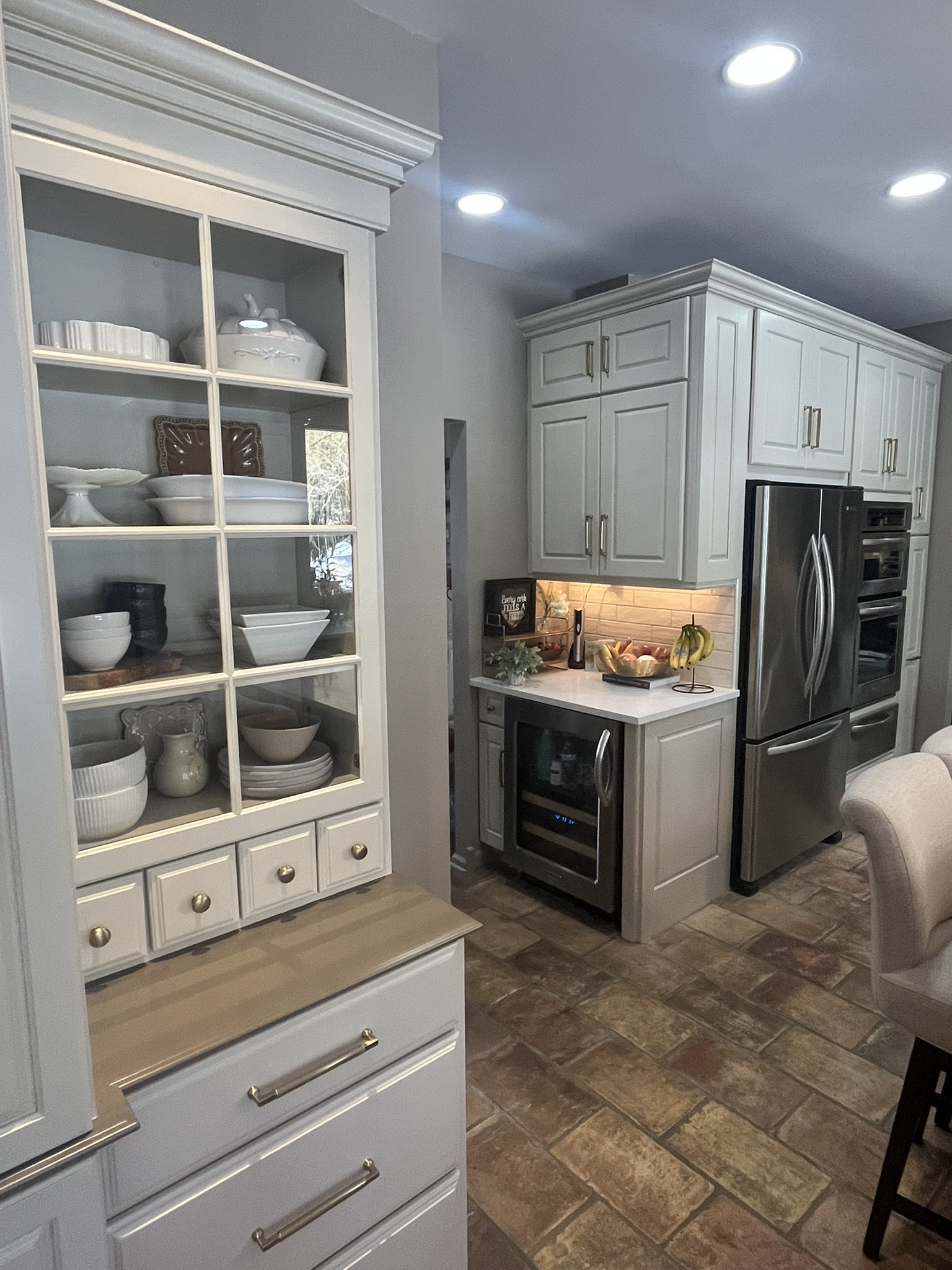
Countertops and Backsplash; who doesn’t want a little calm and serenity?
Next came the counter and backsplash selections.
Because my terracotta floor already commands soooo much visual attention – with multiple colors and prominent grout lines – I knew these elements had to be relatively subdued, and I was going for a calmer more soothing kitchen vibe this time around anyway.
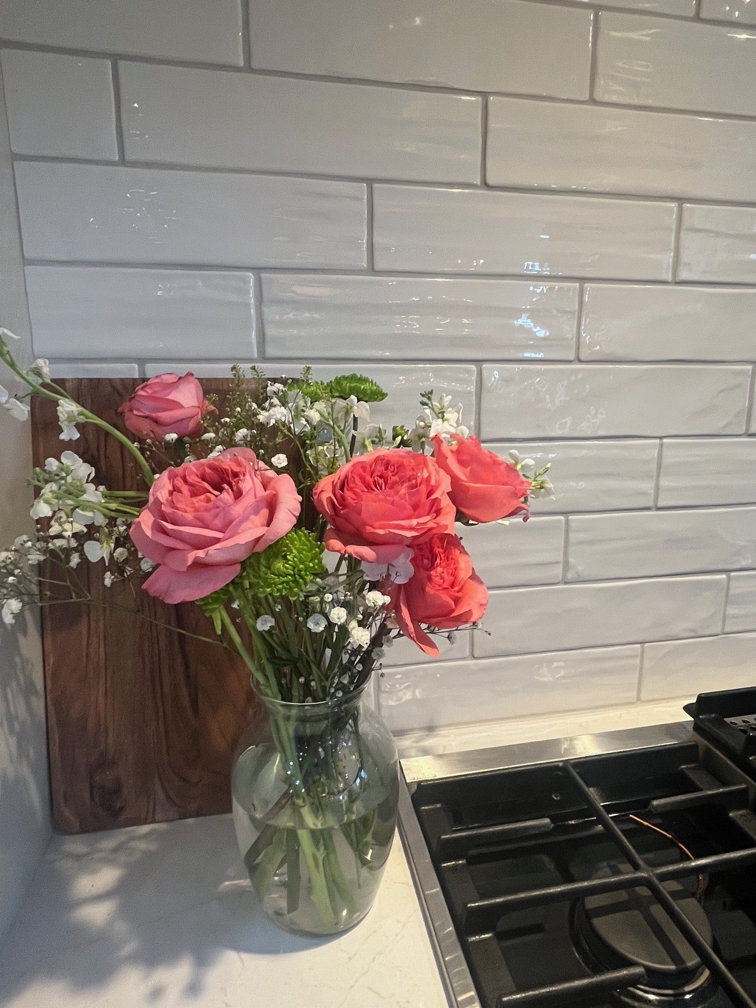
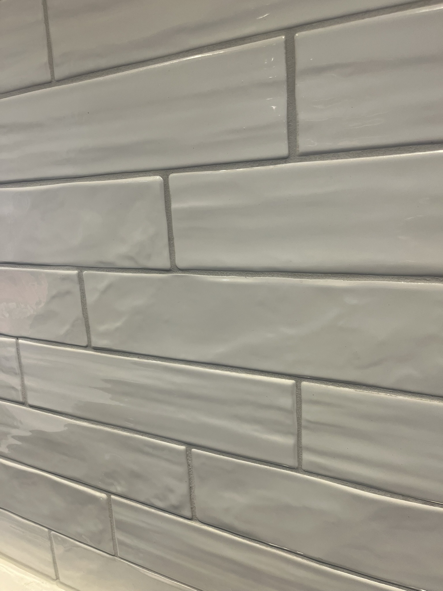
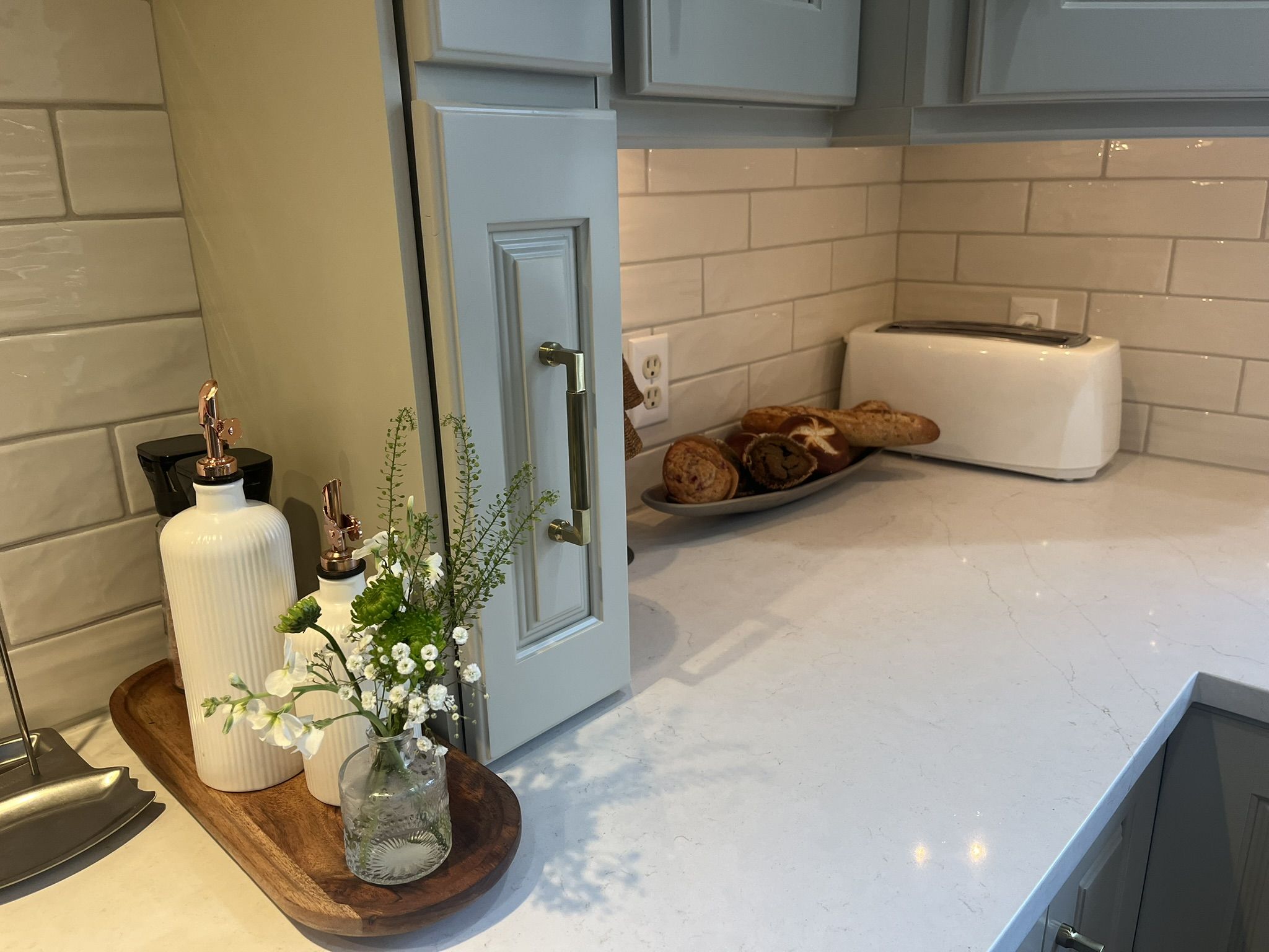
But I definitely didn’t want the splash to be boring. I love zellige-inspired, handcrafted artisan looks, so I chose an elongated 3×12 subway tile from Dal Tile. The color is Coconut in a gloss finish.
To add subtle dimension, we used Alabaster grout, which is actually not very white at all, and creates just enough contrast to provide some visual interest.
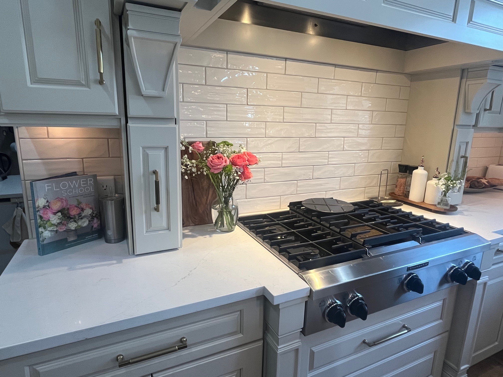
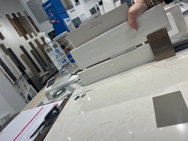
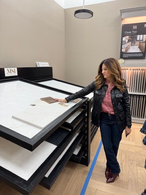
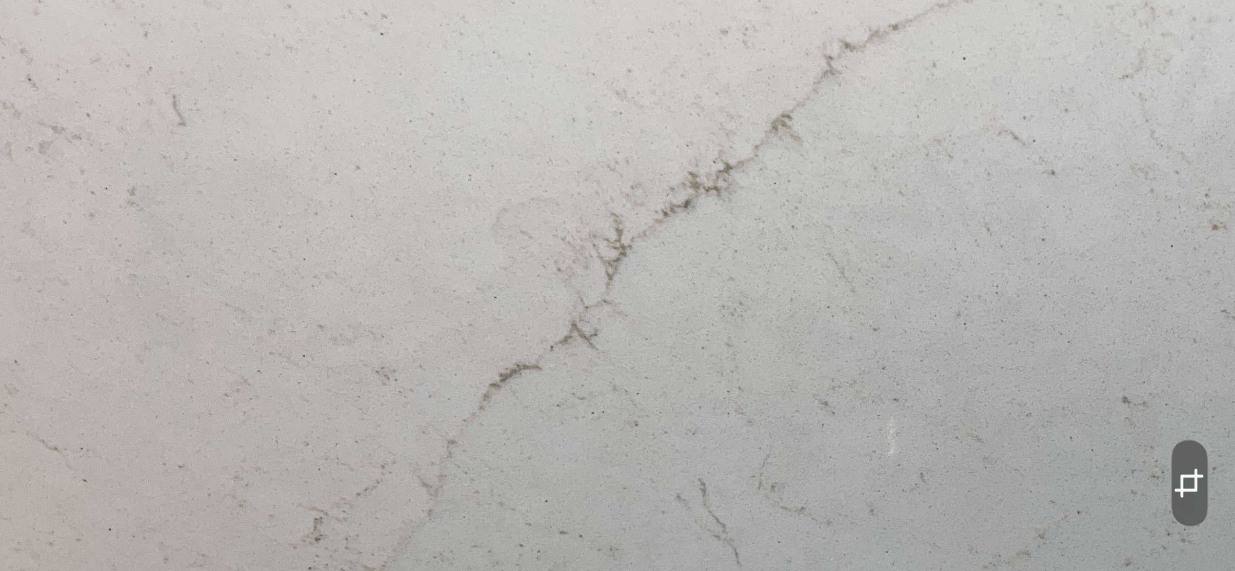
For the counter I wanted a little gold veining, but nothing dramatic that would compete with the floor. I wanted veining you’d enjoy when you were working or eating on the counter, not from across the room.
Enter MSI’s Calcatta Karmelo. The soft gold veins add visual interest and warmth, while staying calm overall, and they tie beautifully into the Bronzed Gold faucet , other gold tones I knew I’d bring in.
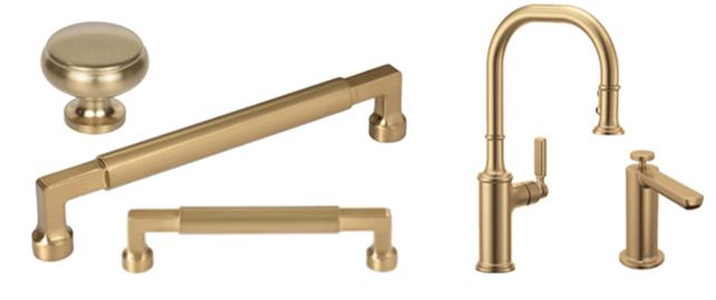
The Gold “Metal” Finish: Hardware and Lighting
Turns out it was surprisingly difficult to find the right gold tone for hardware and lighting to coordinate with the Bronzed gold faucet.
Most golds out there today lean toward the shiny Brushed Gold finishes.
I ordered over a dozen hardware samples from various companies, and found many of the Bronzed Gold to either have an off-putting green tint or were just not right.
Eventually I landed on Top Knob’s Honey Bronze finish.
The Cumberland pull has the cylindrical form that echoes the faucet shape, but because that cylinder sits “on top of” a rectangular base with soft edges and a wide circular base, it brings a more classic feel and adds dimensional interest. I love that this dual-shape style tones down the modernness of a typical cylinder pull.
Side note: I seriously considered going with Polished Nickel tones which I think will be a big finish for the trending Refined Classic/Updated Traditional design style. But ultimately, I just wanted warmth in my kitchen, so gold tones won.
Across the kitchen’s 69 pieces of hardware, I used 4 sizes of pulls plus the knob and I really love the sizes of the hardware on each cabinet door or drawer size. Miraculously, my cabinet refinisher rockstar was able to fill all the old cabinet holes and correctly drill all the new holes, and I finally exhaled.
And guess what? I actually used my own HangYourHardware clear plexi hangers to test out the hardware and see it against the actual cabinets. I am now my own happily satisfied customer, joining the hundreds of builders around the country who are HYH fans!
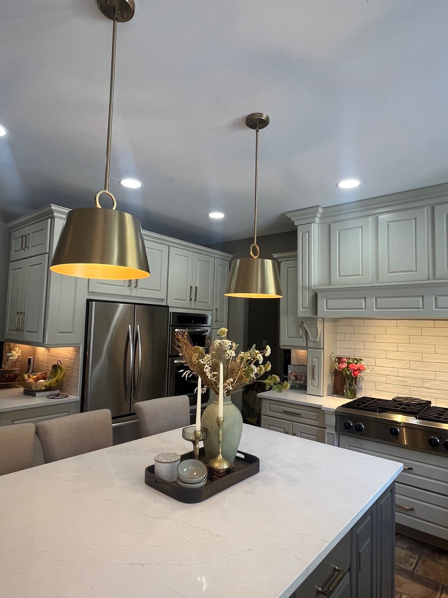
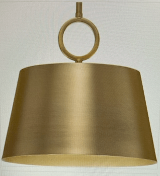
I was concerned that the white tones in the backsplash and counter would look too bland, so I wanted strong pendants in a Bronzed Gold finish to hang over the island and break up all that creamy white.
Finding fixtures in the Bronzed Gold was somewhat challenging but we are seeing more and more product debuts in 2026 with this newer gold tone (suppliers, please keep it coming!)
The tailored look of Progress’ Parkhurst metal pendant did the trick by contrasting strongly Parkhurst to the upper cabinets. I love the refined look of the circular ring detail that sits on the shade. The shade is a super cool shape, neither domelike nor sharply angled.
The brushed finish gives it warmth so it’s not like a slick metal look, and the gold interior casts a beautiful soft glow.
Over the kitchen table, we went with the companion Parkhurst chandelier which brings in the same golden tones without feeling too matchy-matchy.
The glass shades keeps the fixture feeling lighter over the heavier wood stain of the table and chairs. My kitchen table is over 20 years old, I had it custom made and actually still love it. With the new more transitional chairs, it looks less farmhouse-y and more classic.
Final Thoughts
While this remodel was not intended to create my dream kitchen, I’m really pleased with how it turned out.
It feels wonderful to feel in sync with the space I spend time in every day.
Remodel Takeaways:
1. Don’t put off a remodel. Like most things, the sooner you get it done, the more time you have to enjoy it – and usually wish you had done it sooner.
2. Everything takes longer than expected. And scope creep is real (we ended up repainting most of the house interior, and will next be updating the adjacent family room). We planned this in September/October, and it wasn’t finished until January.
3. Making selections one item at a time, in different locations, carrying samples from store to store – it’s just as inefficient and exhausting as I’ve always said it is in my professional world.
Builder design studios exist for many reasons – and one is the real value in one-stop shopping— being able to see everything together and make cohesive decisions at the same time, rather than being forced to lock in one choice at a time – that’s priceless.
- The best design is ALWAYS your own personal expression. Working in design every day can make you feel like your own home has to be perfectly “on trend” (OK…or at least not hopelessly outdated). But the best spaces are the ones that reflect you — your personality, the finishes and features you truly love, and the way you actually want to live in your home. When you walk into a space and feel that little “ahh…this is so me” moment — or even better, “this is the version of me I want to be” — that’s when you know you’ve created the right design.
So: take inspiration from what’s trending, but adapt it in a way that feels authentic to the way you want to live in your space every day.
These days I’m happily spending more time in my kitchen – which is exactly the point. Now I guess I should probably learn how to cook.
To Read more DESIGN INTELLIGENCE blogs from Jane CLICK HERE